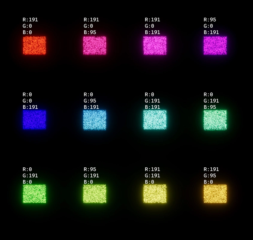
Today my goal was to test and study the intensities of the various colors, because when I implement my color-changing system, I want to scale the intensity of a particle based on the perceived brightness of its color at a control intensity value.
I needed to lay the different colors out in front of me so that I could compare them. As you can see by the GIF above, cycling through the color wheel causes each value to sequentially cycle up to and then down from the maximum saturation value (in my case, 191).
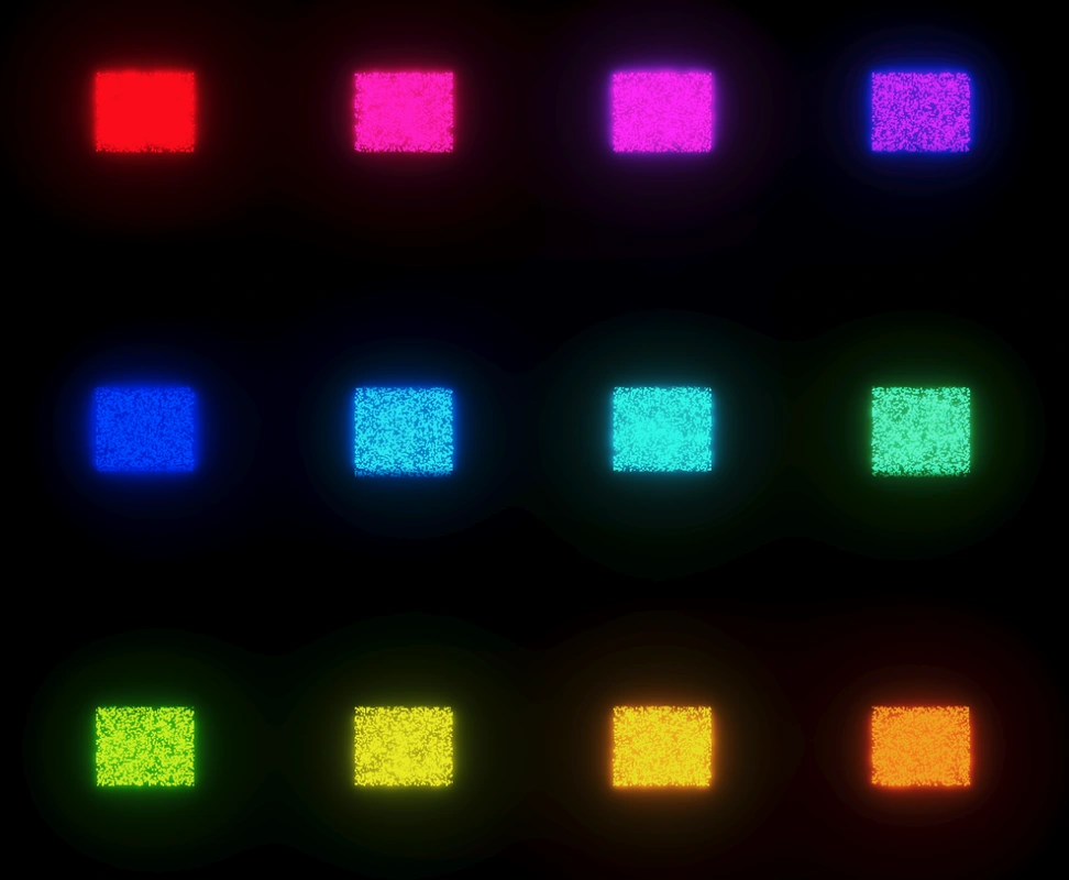
I created a new scene with the same volume settings as my other VFX scene. Then, I created a new VFX graph. In the VFX graph, I created a custom attribute called ‘UV’ that contained a random X and Y value between 0 and 1 to be used as each particle’s coordinate. After using my scalable billboard VFX graph technique (see post on 12/17/23), I assigned each particle a color from a gradient based on its X position value. Unfortunately, Unity’s gradients only allow for 8 color and 8 alpha values, so I rotated my graph 90 degrees, then duplicated it three times in order to make this 4x3 grid pictured below.
From the eye test alone, it’s pretty clear that some of these colors are brighter than others. But I wanted to be exact, so I imported my screenshot into Photoshop and ran a levels filter over it.
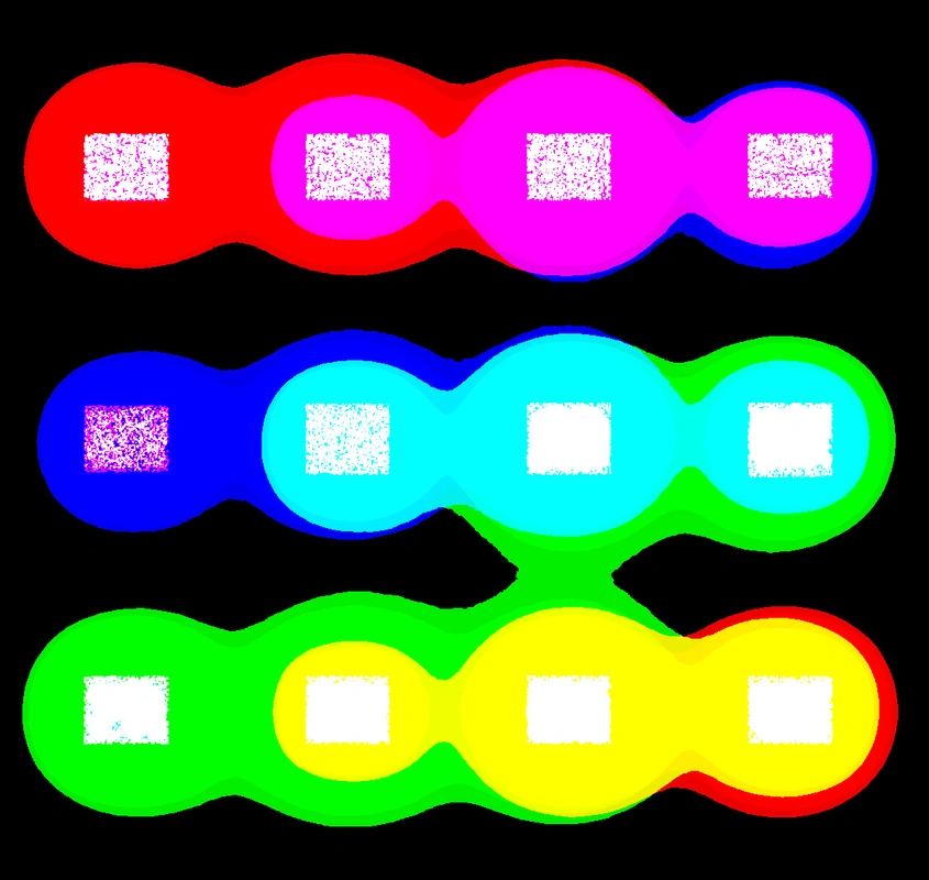
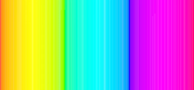
We can see that blue glows less than the other colors. Yellow, despite looking a bit washed out, has the furthest range of glow. Interesting. To visualize the flow between the colors more easily, I took an image of the visible color spectrum and cranked up the levels on it to simulate the color intensity.
We can see that red, green, and blue have pencil-thin areas of existence. It seems when I add intensity to the colors, I sacrifice their even distribution. Well, this is what post-processing is for!
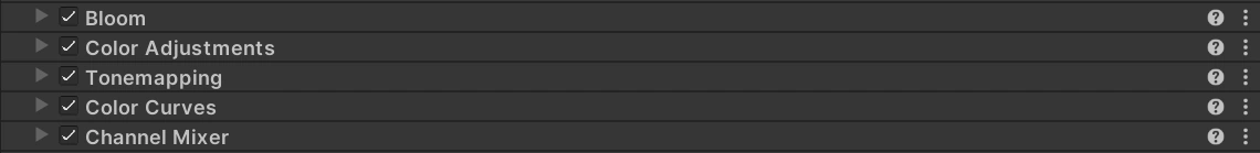
Much better…